Famished on the Freeway: Visualizing, mapping LA restaurant inspections
Use Python, Matplotlib, Plotly to analyze, view graded restaurants on map

Hey there! I used Python, matplotlib, Plotly to analyze LA county, California restaurant inspections results dataset and visualize by mapping out the restaurants with a C grade. Perhaps you can peruse this information after zooming down the freeway (or more likely, sitting in traffic :)). Here’s an overview:
- Import the dataset from kaggle — inspections, violations files
- Create dataframes
- Analyze, sort by number of violations, types etc.
- Group, count by grade, risk and display graphically
- Extract restaurants with low grade (C )and their addresses
- Get their geographic coordinates (latitude, longitude) to use in a map from Google maps, store them to [create] map
- Plot those restaurants’ locations on a map
Before you begin:
- Ensure that you have Python editor or Notebook available for analysis
- Have a Google maps API token (to get coordinates for restaurant locations)
- Have a Mapbox token (to map coordinates onto a map)
Start a new notebook file:
#TSB - Hari Santanam, 2018
#import tools required to run the code
from mpl_toolkits.mplot3d import Axes3D
from sklearn.preprocessing import StandardScaler
import matplotlib.pyplot as plt
import numpy as np
import os
import pandas as pd
import requests
import logging
import time
import seaborn as sns
Read the two dataset files:
- Inspections file is the list of all restaurants, food markets inspected
- Violations file is the list of all the violations found and corresponding facilities (a facility could have multiple violations)
#read in file with all inspections and put in dataframe
df1 = pd.read_csv('../input/restaurant-and-market-health-inspections.csv', delimiter=',')
nRow, nCol = df1.shape
#print number of rows and columns
print({nRow}, {nCol})
#read in file with all health VIOLATIONS and put in dataframe
df2 = pd.read_csv('../input/restaurant-and-market-health-violations.csv')

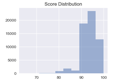
Create a dataframe with the raw inspection scores and plot on a histogram:
#Put these two lines before each plot/graph, otherwise it sometimes #re-draws over the same graph or does other odd things
from matplotlib import reload
reload(plt)
%matplotlib notebook
#draw the histogram for scores
df2['score'].hist().plot()
Type the following for the label description:
#search for missing grade, i.e, that is not A or B or C
df1[~df1['grade'].isin(['A','B','C'])]
#one record (record # 49492) popped up, so we fix it by assigning it a grade C
df1.loc[49492,['grade']] = 'C'
#find out the distribution of the grades, i.e, how many records in each grade
#basically, group dataframe column grade by grade letter, then count and index on that, and print it
grade_distribution = df1.groupby('grade').size()
pd.DataFrame({'Count of restaurant grade totals':grade_distribution.values}, index=grade_distribution.index)
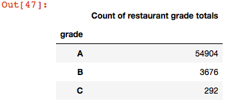
Note that the totals above add up to 58,872, which is the total # of rows in the file, which means there are no rows without a grade.
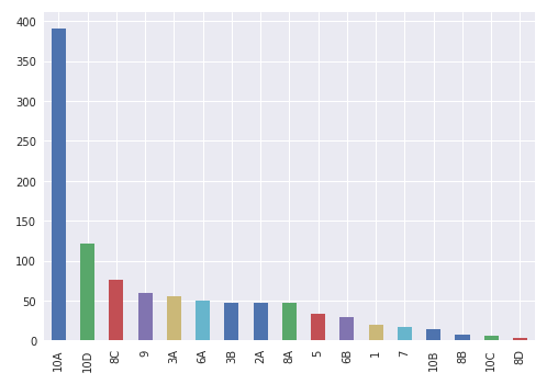
Group by restaurant type (seating type) and count and graph them
#group by restaurant type and count # in each category
#then sort from highest # to lowest, then create a bar graph
temp = df1.groupby('pe_description').size()
description_distribution = pd.DataFrame({'Count':temp.values}, index=temp.index)
description_distribution = description_distribution.sort_values(by=['Count'], ascending=True)
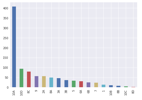
df2['pe_description'].hist().plot()
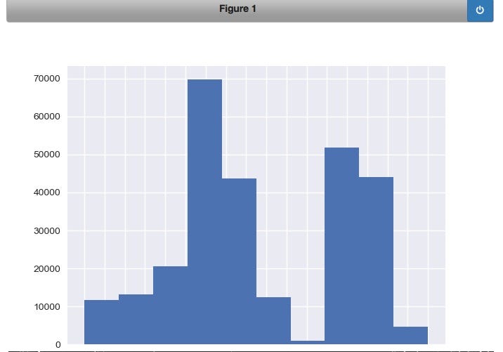
Create a dataframe with the raw inspection scores and plot on a histogram:
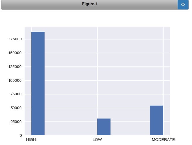
#the previous charts and graphs show breakdown of various types food restaurants with risk
#broken down to high, medium, low.
#This procedure use the split function to break the pe_description field into the sub-string
#after the 2nd space from the end - ex: string x = "Aa Bb Cc", when split applied like this: x.split(' ')[-2] ->sub-string after(not before) 2nd space '=>Bb'
def sub_risk(x):
    return x.split(' ')[-2]
#apply function to get only high, medium, lowdf2['risk'] = df2['pe_description'].astype(str).apply(sub_risk)
#group, count by risk level
temp = df2.groupby('risk').size()
#plot the histogram for the 3 levels of risk
df2['risk'].hist().plot()
Create a dataframe with the raw inspection scores and plot on a histogram:
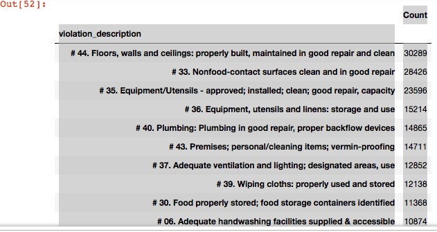
#show first 10 rows of the violations file dataframe
df2.head(10)
#groupb by violation_description, count and sort them from largest violation by count to smallest
violation_description = df2.groupby('violation_description').size()
pd.DataFrame({'Count':violation_description.values},index = violation_description.index).sort_values(by = 'Count',ascending=False)
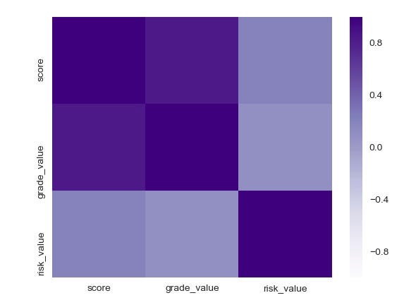
Create a function to convert string defined values to numbers and make a heatmap:
#create a simple proc for heat map for risk - low, moderate, high
def convert_risk_value(x):
    if x == 'LOW':
        return 10
    elif x == 'MODERATE':
        return 5
    else:
        return 0
#create simple proc to map grade to value
def convert_grade_value(x):
    if x == 'A':
        return 10
    elif x == 'B':
        return 5
    else:
        return 0
#call (apply) procs created above
df2['risk_value']=df2['risk'].apply(convert_risk_value)
df2['grade_value']=df2['grade'].apply(convert_grade_value)
df3 = df2.loc[:,['score', 'grade_value', 'risk_value']]
corr = df3.corr()
corr = (corr)
reload(plt)
%matplotlib notebook
sns.heatmap(corr, xticklabels = corr.columns.values, yticklabels=corr.columns.values, cmap="Purples", center=0)
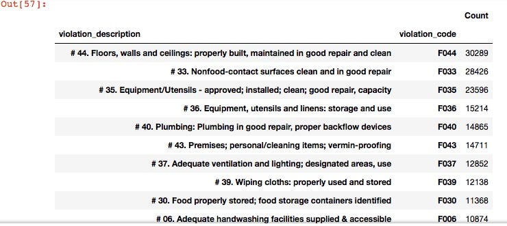
Show the violation counts, in descending order from the most common violation:
#violations listing from most common, descending - violation description, violation code, counts
violation_desc=df2.groupby(['violation_description','violation_code']).size()
pd.DataFrame({'Count':violation_desc.values}, index=violation_desc.index).sort_values(by = 'Count', ascending=False)
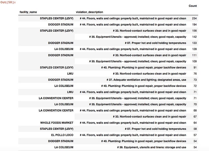
Show facilities with the most violations:
#list facilities with most violations and type of violation
#create a dataframe with facility and violation columns, aggregate by size, then count and sort them
violation_desc2 = df2.groupby(['facility_name','violation_description']).size()
pd.DataFrame({'Count':violation_desc2.values}, index=violation_desc2.index).sort_values(by='Count', ascending=False)
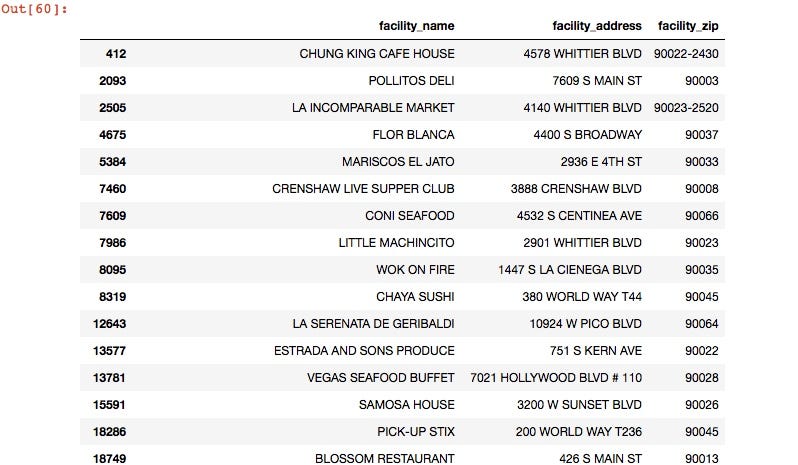
Separate and extract restaurants with grade ‘C’ for mapping. Use the loc function, then drop duplicates so that each restaurant name only appears once. We will use this later for the map.
#get a list of all the restaurants with grade C
df4 = df2.loc[(df2['grade'] == 'C'),['facility_name','facility_address','facility_zip']]
#only want each restaurant listed once, since many of them have multiple violations, or may be listed more than once for multiple inspections or other reasons
df4=df4.drop_duplicates(['facility_name'])
#print
df4
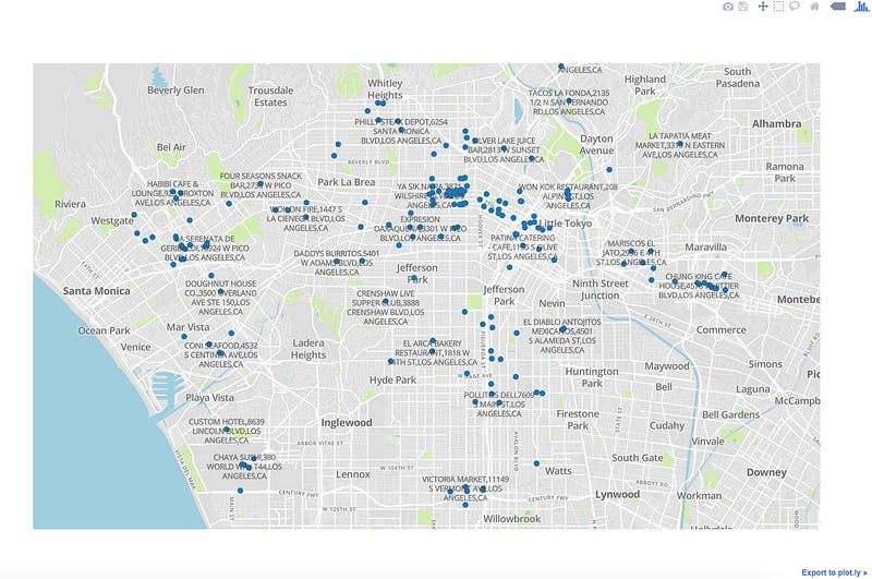
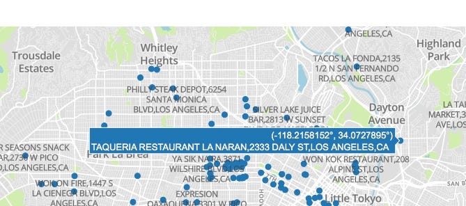
Below, we list the addresses from above (C grade restaurants) and add the city and state (which are the same for all addresses) to use as a full address (location #, street, city, state) this is required as there could be streets and towns with the same name in other areas around the country and the world) as an argument to call the google maps api, which will give us the geographic coordinates (latitude, longitude) which we will then overlay on a map of LA county, CA.
#visualize bad restaurants (grade C)on a map, so that if you are in that area, you can avoid them :)
#some of them might have remediated their violations, or may be operating under "new management" or maybe even turned over a new leaf - we just don't know
addresses_to_avoid = df4['facility_address'].tolist()
addresses_to_avoid = (df4['facility_name'] + ',' + df4['facility_address'] + ',' + 'LOS ANGELES' + ',CA').tolist()
Add in some console handling, some constants:
#some logging and console handling system items
logger = logging.getLogger("root")
logger.setLevel(logging.DEBUG)
ch = logging.StreamHandler()      #console handler
ch.setLevel(logging.DEBUG)
logger.addHandler(ch)
#some constants for our upcoming function
address_column_name = 'facility_address'
restaurant_name = 'facility_name'
RETURN_FULL_RESULTS = False
BACKOFF_TIME = 30                 #for when you hit the query limit
#api key needed for the call to google maps -if you are wondering #what this is, you missed the 1st couple of paragraphs, please go #back and re-read
API_KEY = 'your api key here'
output_filename = '../output-2018.csv'
#output file stores lat,lon
Create function that calls each address from our list above, and passes a call to google maps to get the coordinates that will be used to overlay on a map of LA, California.
logger = logging.getLogger("root")
logger.setLevel(logging.DEBUG)
ch = logging.StreamHandler()      #console handler
ch.setLevel(logging.DEBUG)
logger.addHandler(ch)
address_column_name = 'facility_address'
restaurant_name = 'facility_name'
RETURN_FULL_RESULTS = False
BACKOFF_TIME = 30
API_KEY = 'AIzaSyCNAnCjzfpA3LJYeWGVpCdTKr4ZK_kiFb4'
output_filename = '../output-2018.csv'
#print(addresses)
#adapted from Shane Lynn - thanks
def get_google_results(address, api_key=None, return_full_response=False):
    geocode_url = "https://maps.googleapis.com/maps/api/geocode/json?address={}".format(address)
    if api_key is not None:
        geocode_url = geocode_url + "&key={}".format(api_key)

        #ping google for the results:
        results = requests.get(geocode_url)
        results = results.json()

        if len(results['results']) == 0:
            output = {
                "formatted_address" : None,
                "latitude": None,
                "longitude": None,
                "accuracy": None,
                "google_place_id": None,
                "type": None,
                "postcode": None
            }
        else:
            answer = results['results'][0]
            output = {
                "formatted_address" : answer.get('formatted_address'),
                "latitude": answer.get('geometry').get('location').get('lat'),
                "longitude": answer.get('geometry').get('location').get('lng'),
                "accuracy": answer.get('geometry').get('location_type'),
                "google_place_id": answer.get("place_id"),
                "type": ",".join(answer.get('types')),
                "postcode": ",".join([x['long_name'] for x in answer.get('address_components')
                                  if 'postal_code' in x.get('types')])
            }

        #append some other details
        output['input_string'] = address
        output['number_of_results'] = len(results['results'])
        output['status'] = results.get('status')
        if return_full_response is True:
            output['response'] = results

        return output
Call the function, and if all goes well, it will write the results out to a specified file. Note: Every so often, the call will hit a “Query limit” bump imposed by Google, so you will either have to call those manually (after filtering from the file) or delete them from your output file.
#for each address in the addresses-to-avoid list, call the function we just created above, to get the coordinates, and add to a new list called results2
results2=[]
for address in addresses_to_avoid:
    geocode_result = get_google_results(address, API_KEY, return_full_response=RETURN_FULL_RESULTS)
    results2.append(geocode_result)
#now, convert the list with our geo coordinates into a csv file that will be called by another program to overlay on a map.
pd.DataFrame(results2).to_csv('/Users/hsantanam/datascience-projects/LA-restaurant-analysis/restaurants_to_avoid.csv', encoding='utf8')
We are almost done. I could have created a function in the same code, but for readibility and understanding, did it in a new program, which sets the configuration for the map, calls the data from the output file with the address coordinates that we just created above, and draws it on a browser tab. Here it is, along with the output: (embedded script with github gist may not display properly below, so here is a link)
And here, finally, is the result — visual map output of the code above.
Thank you for patiently reading through this :). You are probably hungry by now — if you happen to be this area, find a restaurant and eat, just not in the ones with the bad grade!
The github link to this is here.
Note: This article is also posted in Medium.com here.